


REPLACE Electrolytes | Brand Identity & Packaging
REPLACE is a sustained-release electrolyte supplement built for people who don't stop: surfers, runners, and athletes who need hydration that keeps up for hours, not minutes.
-
REPLACE es un suplemento de electrolitos de liberación prolongada diseñado para personas que no paran: surfistas, corredores y atletas que necesitan una hidratación que esté a la altura de su ritmo durante horas, no minutos.


Packaging & Brand design | KONEKO Tea
KONEKO es una marca de té premium en hebras que combina una estética oriental con una propuesta de packaging pensada para transmitir tanto el valor del producto como la identidad de la marca. Más que vender té, KONEKO vende un momento de traslación: el ritual de preparar el té es, en sí mismo, el viaje.
La marca está pensada para el mercado argentino, con distribución inicial en Buenos Aires, y dirigida a un público millennial que creció con la cultura oriental y sigue siendo parte de ella.
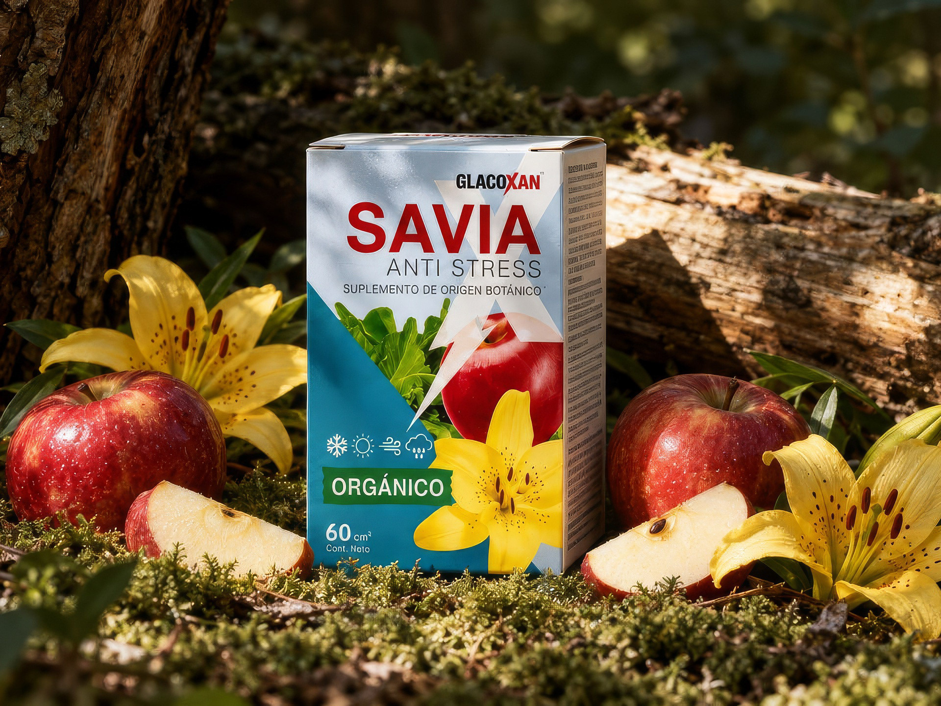
Packaging Diseño de Linea Orgánica SAVIA
Part of a three-product organic system, GlacoXan SAVIA packaging translates sustainability and agricultural performance into a clean, contemporary visual language.
Parte de un sistema orgánico de tres productos, el packaging de GlacoXan SAVIA sostenibilidad y rendimiento agrícola en un lenguaje visual limpio y contemporáneo.


Marlen Branding
Marlen is a warm, intimate brand for women who choose to feel — in their body and space. Its logo is built from three forms: the curves of the feminine body, the heart, and the flame. Through curated lingerie, Marlen honors intimacy and authenticity, carrying an effortless, personal warmth that empowers every woman who wears it.
-
Marlen es una marca cálida e íntima para mujeres que eligen sentir — en su cuerpo y en su espacio. Su logo está construido a partir de tres formas: las curvas del cuerpo femenino, el corazón y la llama. A través de lencería femenina curada, Marlen honra la intimidad y la autenticidad, con una calidez cercana y personal que empodera a cada mujer que la elige.


GS GROW | Visual Identity
GS GROW is a horticultural LED lighting brand that blends technology, nature, and design into a vibrant and contemporary visual identity.
-
GS GROW es una marca de iluminación LED para horticultura indoor que combina tecnología, naturaleza y diseño en una identidad visual vibrante y contemporánea.


ENDUR | Rebrand
Brand rebuild for ENDUR, a clean supplement brand focused on everyday health support.
The project involved redefining the brand’s visual and messaging system to create clarity, consistency, and scalability across packaging, digital, and ecommerce touchpoints.
Role: Brand direction, visual system design, and creative leadership.


Aikidojo — Identity Design
Brand identity inspired by Aikido philosophy, the dojo’s architecture, and the Japanese Enso. The mark abstracts the distinctive roof structure, while the custom typography incorporates brush-inspired strokes
reflecting balance and flow.
-
Identidad de marca inspirada en la filosofía del aikido, la arquitectura del dojo y el Enso japonés. El símbolo abstrae la distintiva estructura del techo, mientras que la tipografía personalizada incorpora trazos inspirados en la pincelada, que reflejan equilibrio y fluidez.


Packaging Design — GlacoXan
Part of a three-product organic system, GlacoXan Potassium Soap's packaging translates sustainability and agricultural performance into a clean, contemporary visual language. Built on the idea that nature works in balance — nothing wasted, nothing missing — the design blends natural palettes and technical clarity to position the product between performance and environmental care.
Parte de un sistema orgánico de tres productos, el packaging de GlacoXan Potassium Soap traduce sostenibilidad y rendimiento agrícola en un lenguaje visual limpio y contemporáneo. Sobre la idea de que la naturaleza trabaja en equilibrio — nada se desperdicia, nada falta — el diseño combina paletas naturales y claridad técnica para posicionar el producto entre el rendimiento y el cuidado ambiental.


C2 Infinity | Brand Identity & Integrated System
This project involved the complete creation and development of the brand from the ground up. I led the process end-to-end — defining the core concept and strategy, designing the visual identity, and building a cohesive, scalable system across website design, digital applications, editorial pieces, and print materials.
-
Este proyecto implicó la creación y el desarrollo integral de la marca desde sus cimientos. Lideré el proceso de principio a fin: definí el concepto central y la estrategia, diseñé la identidad visual y desarrollé un sistema coherente y escalable para el diseño web, las aplicaciones digitales, las piezas editoriales y los materiales impresos.


Fundación Favaloro
Comprehensive institutional communication development for congresses, symposiums, and academic events at Fundación and Universidad Favaloro, encompassing editorial design, posters, stationery, and internal communication systems, while maintaining visual consistency across academic and healthcare contexts.
-
Desarrollo integral de comunicación institucional para congresos, simposios y eventos académicos de la Fundación y la Universidad Favaloro, abarcando diseño editorial, afiches, papelería y sistemas de comunicación interna, manteniendo coherencia visual en distintos contextos académicos y hospitalarios.


CRUZ ROJA Argentina
Cruz Roja Argentina required a secure and accessible digital platform to manage internal assemblies and voting processes.
I designed the website, led the project, and organized the workflow system for internal voting — ensuring clarity, usability, and a structured process aligned with the organization’s needs.
-
Cruz Roja Argentina necesitaba una plataforma digital segura y accesible para gestionar asambleas internas y procesos de votación. Diseñé el sitio web, lideré el proyecto y organicé el sistema de trabajo para las votaciones internas, garantizando claridad, facilidad de uso y un proceso estructurado, alineado con las necesidades de la organización.

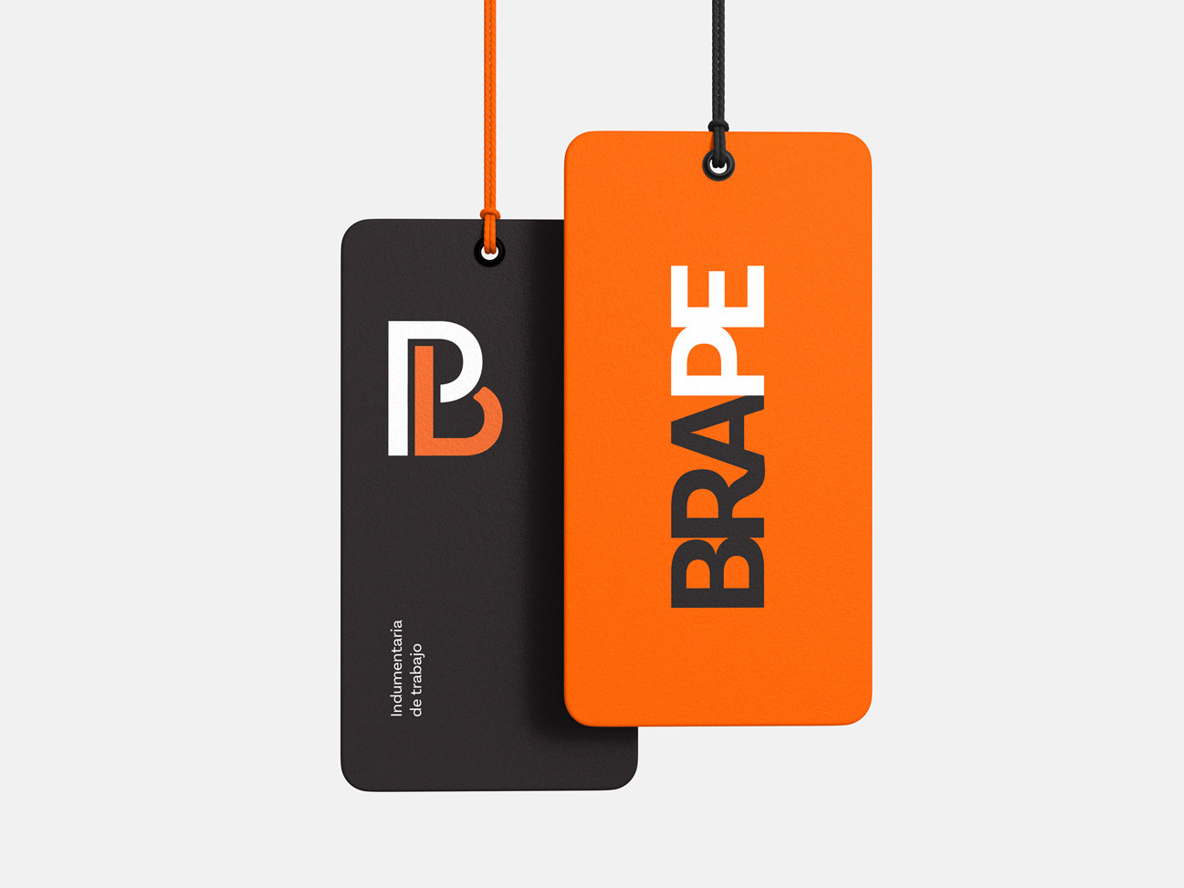
BRAPE — Brand Identity
BRAPE is a workwear brand designed for industrial and construction environments.
I developed the brand identity, including logo design, iconography, and graphic applications for apparel and print, building a visual system rooted in strength, durability, and safety.
-
BRAPE es una marca de indumentaria de trabajo diseñada para entornos industriales y de la construcción. Desarrollé la identidad de marca, incluyendo el diseño del logo, la iconografía y las aplicaciones gráficas para indumentaria y piezas impresas, construyendo un sistema visual basado en la resistencia, la durabilidad y la seguridad.


Current powered by GE
Designed and developed marketing email campaigns for GE, Current by GE, and General Electric. Responsible for layout, visual consistency, and responsive design, with final implementation and distribution through Marketo.
-
Diseño y maquetación de campañas de email marketing para GE, Current by GE y General Electric. Responsable de la estructura visual, coherencia de marca y adaptación responsive, con implementación y envío a través de Marketo.


Margarita TV Show
Margarita is a TV series developed by Cris Morena.
I was invited to participate in a curated selection process, where several selected agencies and creatives were commissioned to propose branding concepts for the new series. I collaborated with Cris Morena and her team, contributing visual identity explorations and creative directions.
-
Margarita es una serie de televisión desarrollada por Cris Morena. Participé por invitación en un proceso de selección curado, en el que se encargó a varias agencias y profesionales creativos seleccionados que propusieran conceptos de marca para la nueva serie. Colaboré con Cris Morena y su equipo, aportando exploraciones de identidad visual y direcciones creativas.

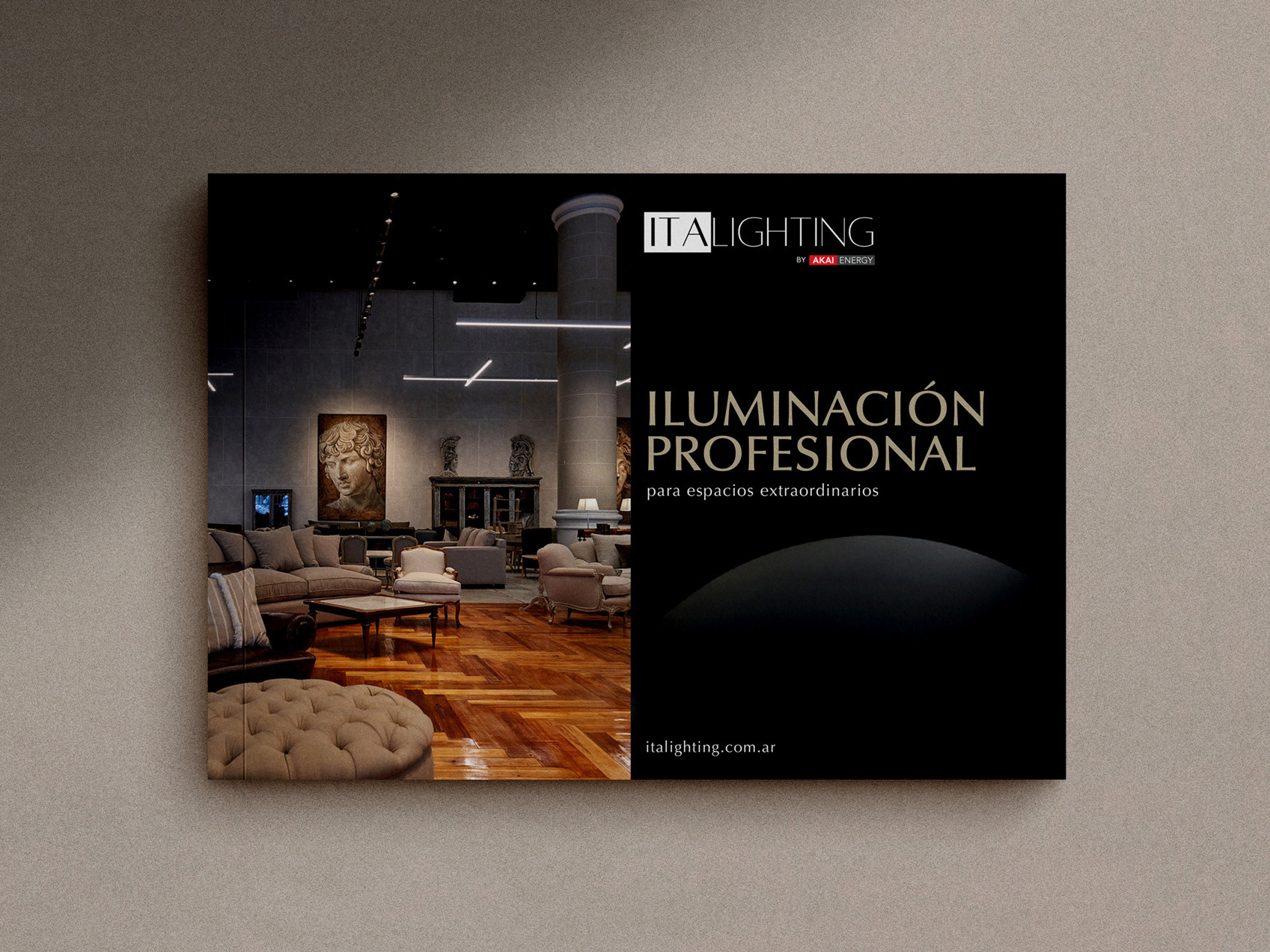
ITA Lighting
We developed a new digital experience for ITA Lighting, combining the comprehensive development of its WordPress website with the editorial design of its product catalogs. The project aimed to organize and present its professional lighting offering in a clear, functional way, aligned with the brand’s premium positioning.
-
Desarrollamos una nueva experiencia digital para ITA Lighting, combinando el desarrollo integral de su sitio web en WordPress con el diseño editorial de sus catálogos de productos. El proyecto buscó organizar y presentar su propuesta de iluminación profesional de forma clara, funcional y alineada con el posicionamiento premium de la marca.


GE Industrial Solutions
Email marketing designs created for General Electric Industrial Solutions, developed in alignment with the brand guidelines. The work focused on translating the corporate visual system into clear, structured, and engaging email communications.
-
Diseños de email marketing creados para General Electric Industrial Solutions, desarrollados de acuerdo con los lineamientos de marca. El trabajo se centró en traducir el sistema visual corporativo en comunicaciones por email claras, estructuradas y atractivas.

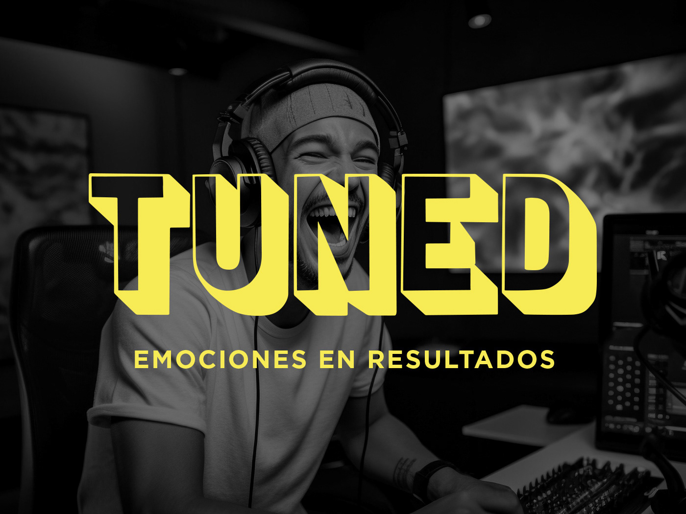
TUNED | Branding & Web
TUNED is a modern performance platform designed for streamers.
I developed the brand identity and visual system, including brand applications and graphic assets. The web and app design are currently in development and are not publicly available yet.
-
TUNED es una plataforma de rendimiento moderna diseñada para streamers. Desarrollé la identidad de marca y el sistema visual, incluidas las aplicaciones de marca y los recursos gráficos. El diseño del sitio web y la aplicación se encuentra actualmente en desarrollo y todavía no está disponible públicamente.